eCommerce UX Overhaul
Full site redesign
The Grommet specializes in unique and innovative products from small businesses and inventors. While a certain amount of “folksiness” resonates with the brand, the website was badly outdated when I joined the team. Both the experience and visuals had fallen behind modern standards, so working closely with Product experts and other stakeholders throughout the business, we set off to create something which would perform above and beyond modern standards.
User research
This process began with a discovery phase, in which we explored who our users were, analyzed the existing experience, and identified areas of focus for the redesign. A combination of email surveys, real customer conversations, and third party research revealed our core user persona: semi-affluent women age 45+. This group is comfortable shopping online, but is not necessarily highly tech savvy. We would need to take care not to deviate too far from standards and conventions without having a good reason.
We also identified a few “high potential” groups, whom The Grommet was not currently capitalizing on. Among these were young professionals who prioritize conscientious shopping, and were likely to be early adopters. Creating an experience and overall design which could excite these users, while remaining safe and familiar for our core user base became a foundational element of my approach moving forward.
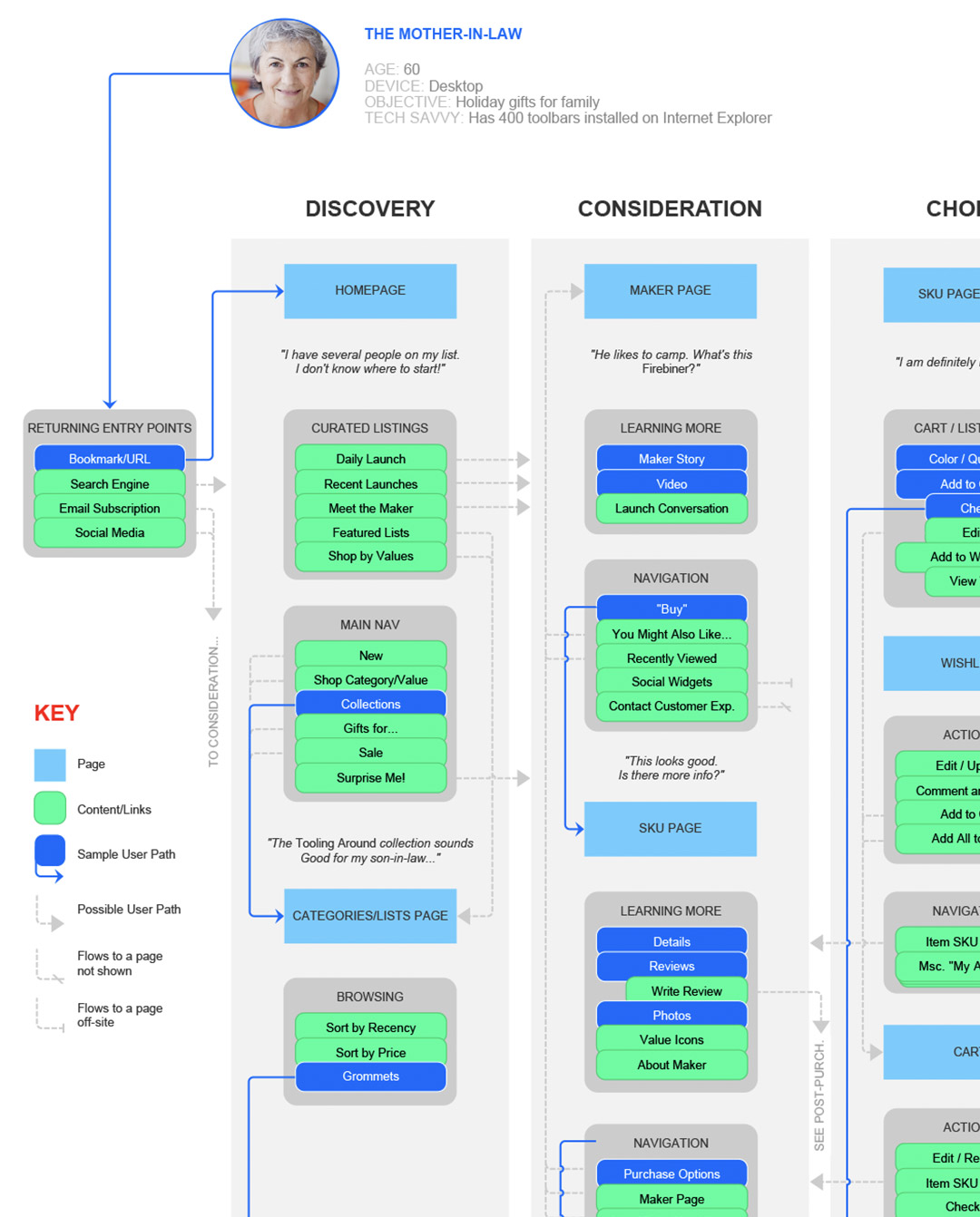
Decision Maps like this one helped to explore paths through our shopping funnel from the perspective of different users.
scenarios
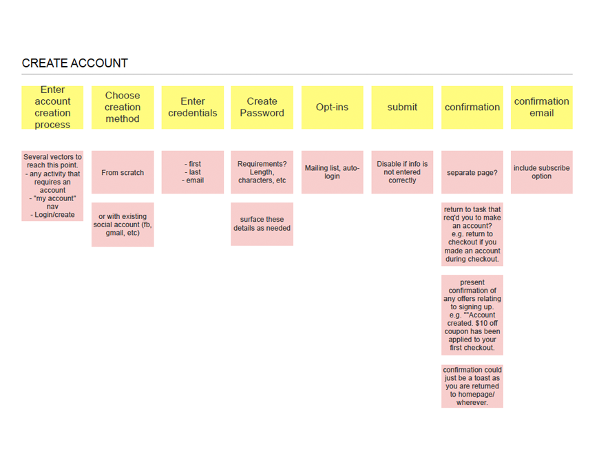
In tandem with this effort, the Product Director and I began a Scenario Building exercise which would allow us to map out all of the tasks and features we would be building. Taking a user-centered approach, we broke out the many tasks customers need to accomplish during the various stages of their ecommerce journey. In many ways, this provided us with a list of “table stakes” elements we would need to create, and gave us a foundation from which to innovate, reinvent, and refine.
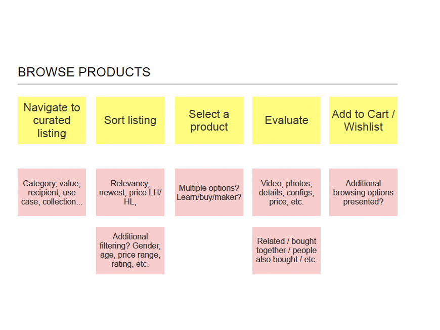
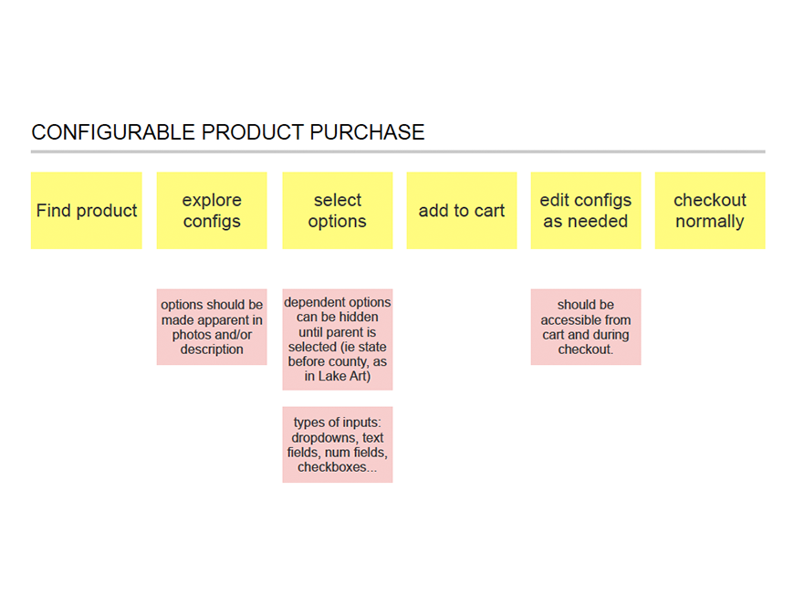
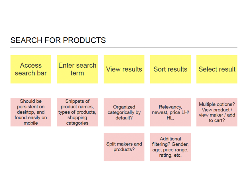
A small sampling of scenarios. This exercises was one of our first chances to formalize ideas and open questions.
Mapping the Journey
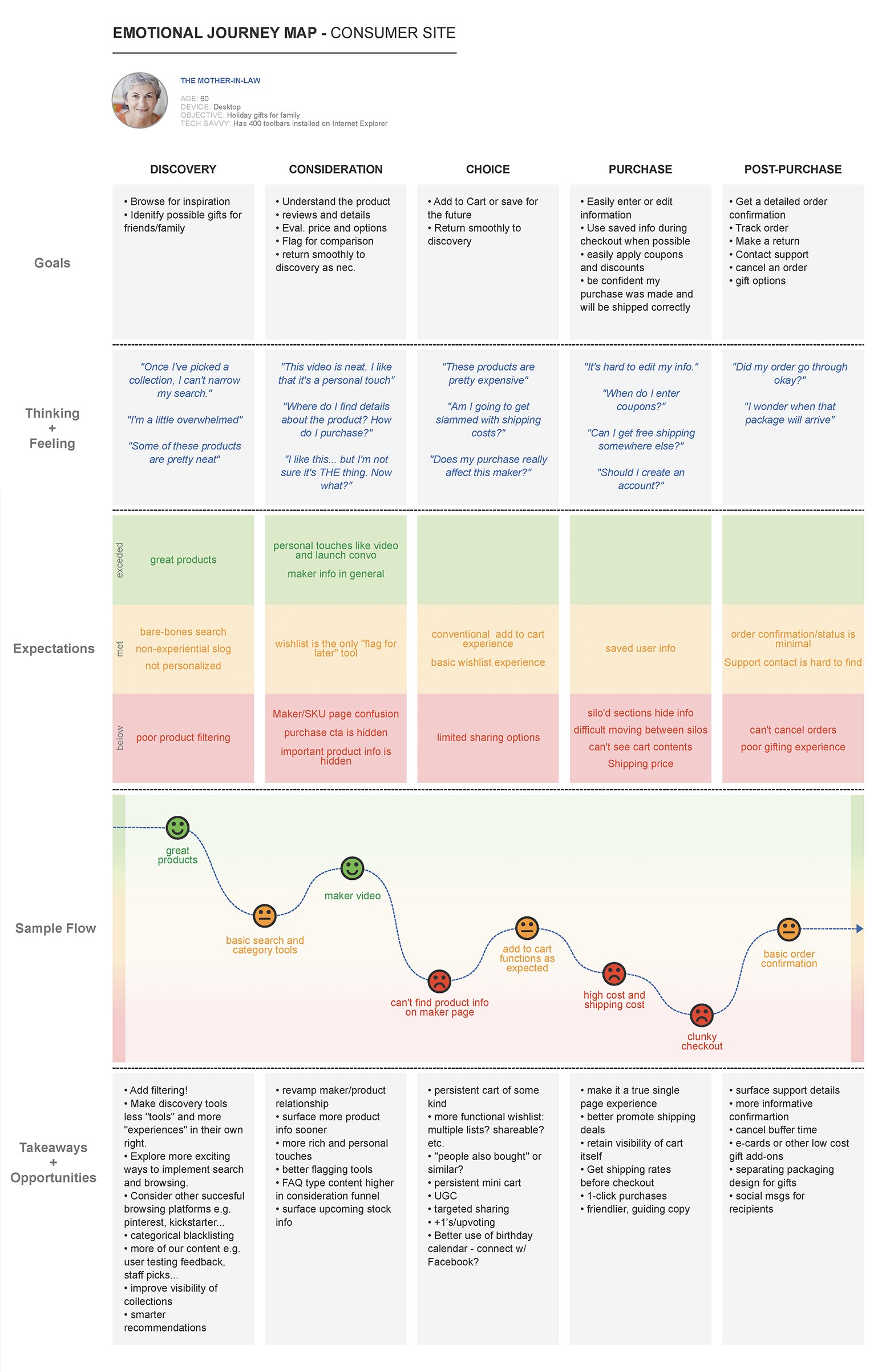
At this point we were ready to begin the real work of understanding where our existing site experience was succeeding, and where it was failing. Leveraging insights from analytics, customer surveys, competitive analysis, customer interviews, and user tests, I developed a journey map which would serve as our north star in the months which followed. It spelled out in simple terms what our users were thinking and feeling at each step through the ecommerce journey. This allowed us to double down in areas where we were successful, and make corrections in areas where we were weak. What’s more, the supporting research made prioritizing updates easy.
This document kept us centered on what mattered throughout the lifespan of the project.
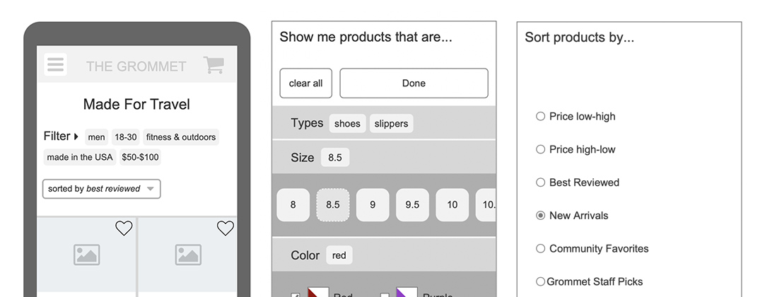
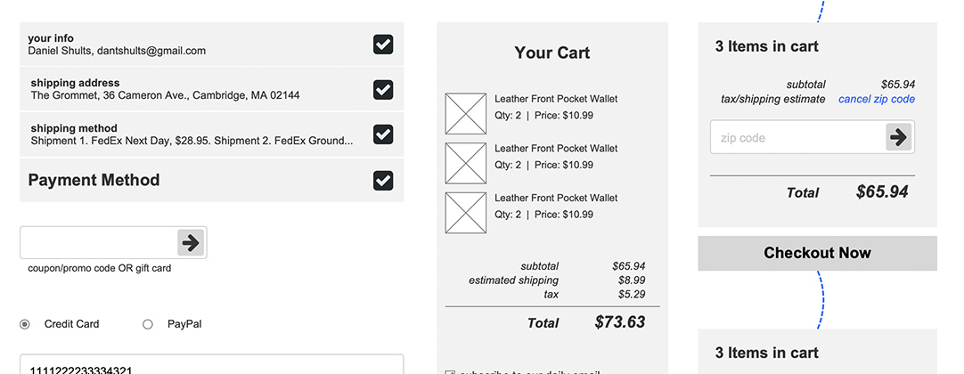
Efficient prototypes balance their level of fidelity against the time required to make updates and test again.
Validating Ideas
Leveraging these insights, I began mocking up solutions and producing robust prototypes for use with internal stakeholders and real customers. This exercise allowed me to polish parts of the new experience where we identified friction, and validated some of the “new and different” ideas which more conservative stakeholders were wary of. While the visual fidelity was kept fairly low for these prototypes, the functional fidelity was adjusted to serve the parts of the experience I was testing. For example, it was important that the cart accurately track its contents and subtotal, so that we could determine if a tax and shipping estimate could be added and understood.
next steps
Now that I had a clear picture of what I needed to build, and for whom, it was time to take the ideas I had developed and flesh them out with beautiful, scalable UI. Find out more about the next phase of the project in my entry on eCommerce User Interface Redesign.