eCommerce UI Redesign
Branded. Functional. Beautiful
With a proven plan for a new user experience for The Grommet, I was tasked with developing the User Interface from a visual design and brand standpoint.
finding the brand
The first step was coordinating with other designers on a brand facelift. While I was not principally responsible for this, I did provide input on topics ranging from updating our typefaces and color palette, to deciding which elements of our existing branding should be maintained or left behind. The research I had performed to understand our various user-types afforded me a unique perspective on how the brand resonated with them, and where improvements should be made. We realized we needed to move away from the crafty, hand-made aesthetic we had previously embraced, as this was not a space for which we could own mindshare against the likes of Etsy. Instead, we moved toward a cleaner, less obtrusive style which would emphasize our product photography and video, as these were identified as strong differentiators for us.
We purposefully distanced the new look and feel from the old hand-made aesthetic, which did not accurately represent our products, and drew attention away from our strong media.
paring the patterns
While these discussions were taking place, I began taking stock of the current UI system. Unfortunately, a combination of outdated design software, lack of style guides and component libraries, and years of design debt had left the site lacking coherence and consistency. Before I could make updates, I found it useful to consolidate this scattered landscape into a reduced set of styles and patterns which eliminated redundancy and needless variation. Taking this in combination with the prototypes I had developed for the new experience, it was possible to form a complete picture of exactly what components, styles, and patterns I needed to design.
Layout logic
It was important to me that the new design system be flexible, modular, and adaptable, so that it could evolve over time as we made updates. With about 60% of our users accessing the site on mobile devices, but a majority making actual purchases on larger screens, it was of course essential that the site be natively responsive, and that the design system be planned with this in mind. To achieve these goals, I worked closely with our Engineering team to establish foundational systems which the entire site would be built upon. The first was a grid column layout which would constrain the sizing of components, and establish how things would reflow across different screen sizes. The second was a vertical spacing system that would dictate how type displays, and also establish rules for the margins and paddings of components.
In addition to building creative and experiential consistency, systems like these reduce the overhead involved in designing and building future pages and components.
A sampling of tiles where I explored options for applying the brand colors.
Style tiles
With this foundation in place, I was ready to begin exploring how the updated branding would actually translate into final UI. I approached this problem by way of “style tiles”- small collections of miscellaneous components which can be rapidly iterated upon for the purpose of dialing in look and feel. In this way, I developed a beachhead in the effort to translate the new type, colors, etc., into a functional UI system.
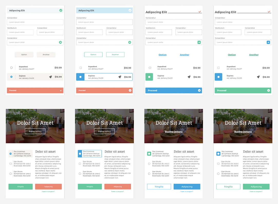
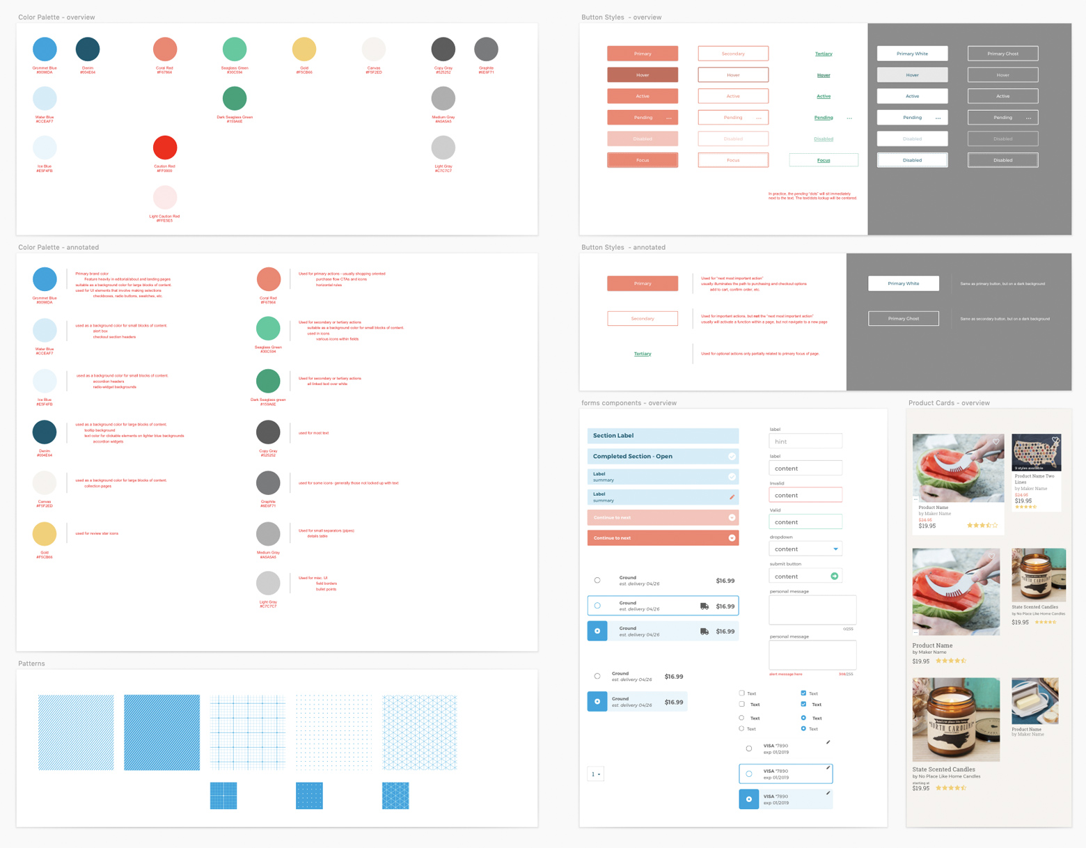
Asset Library
At last, it was time to begin creating full page layouts with finalized UI. As I worked, every new component, style, and pattern was meticulously entered into an asset library, from which all future designs would draw. In this way, future updates would automatically propagate across all of our files. Systems like this are essential for ensuring that projects are not crippled by the gradual accrual of design debt, and save designers countless hours that would be spent making manual updates.
A well organized library makes finding, using, and updating components easy.
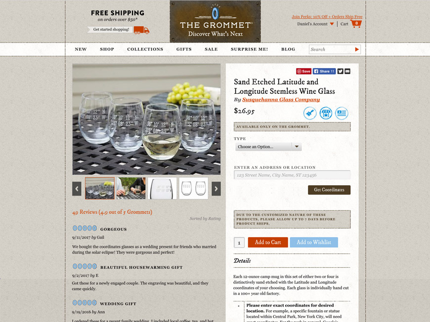
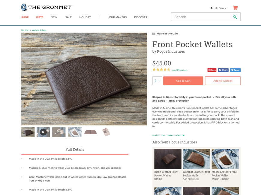
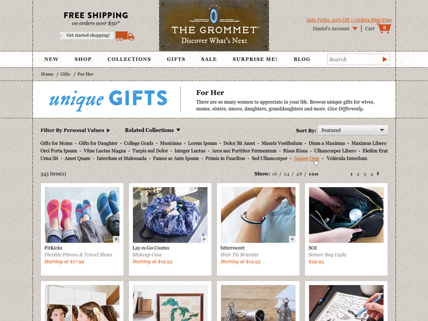
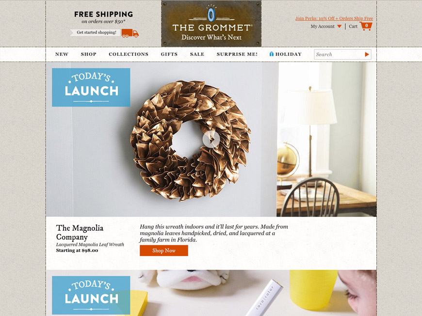
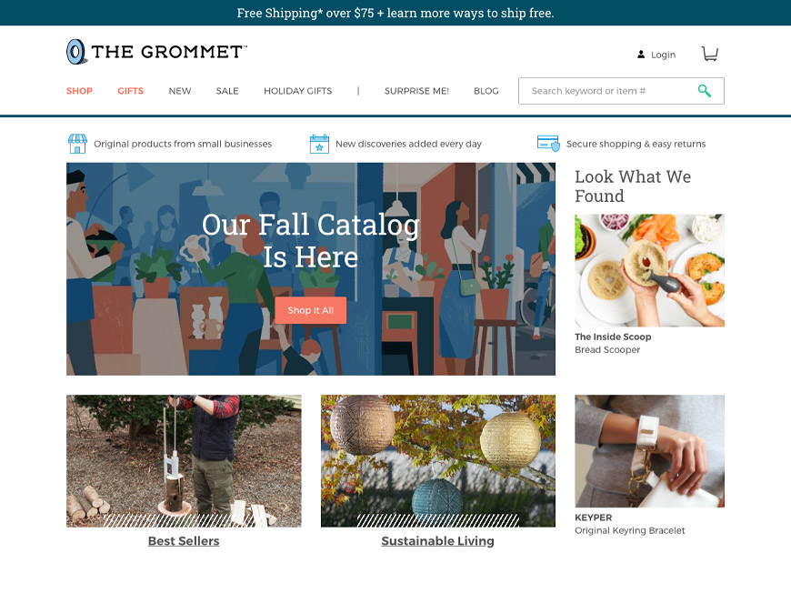
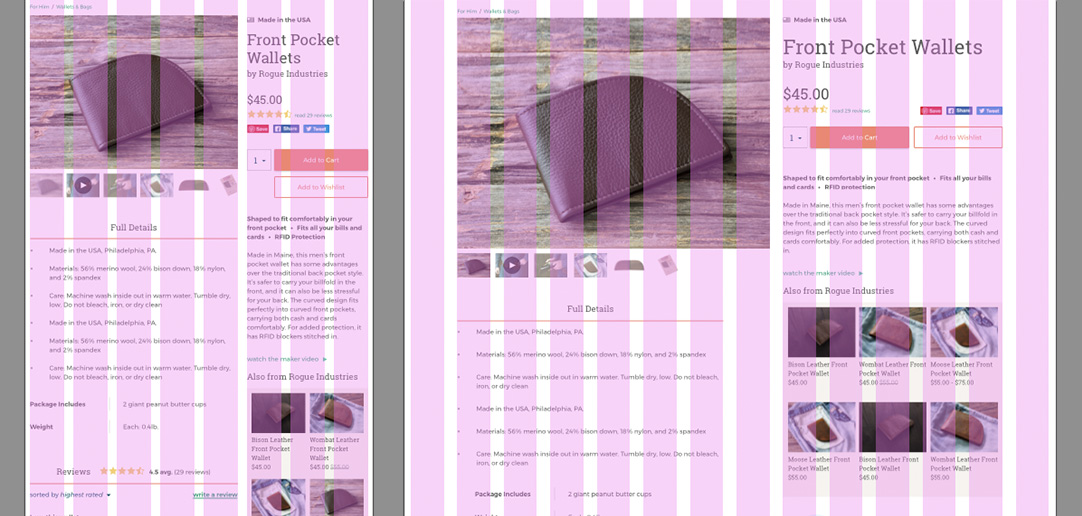
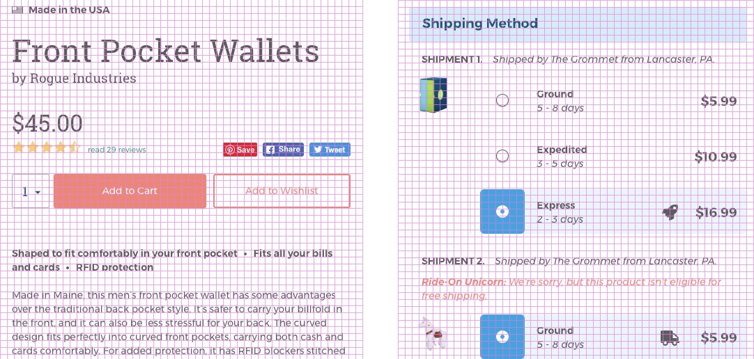
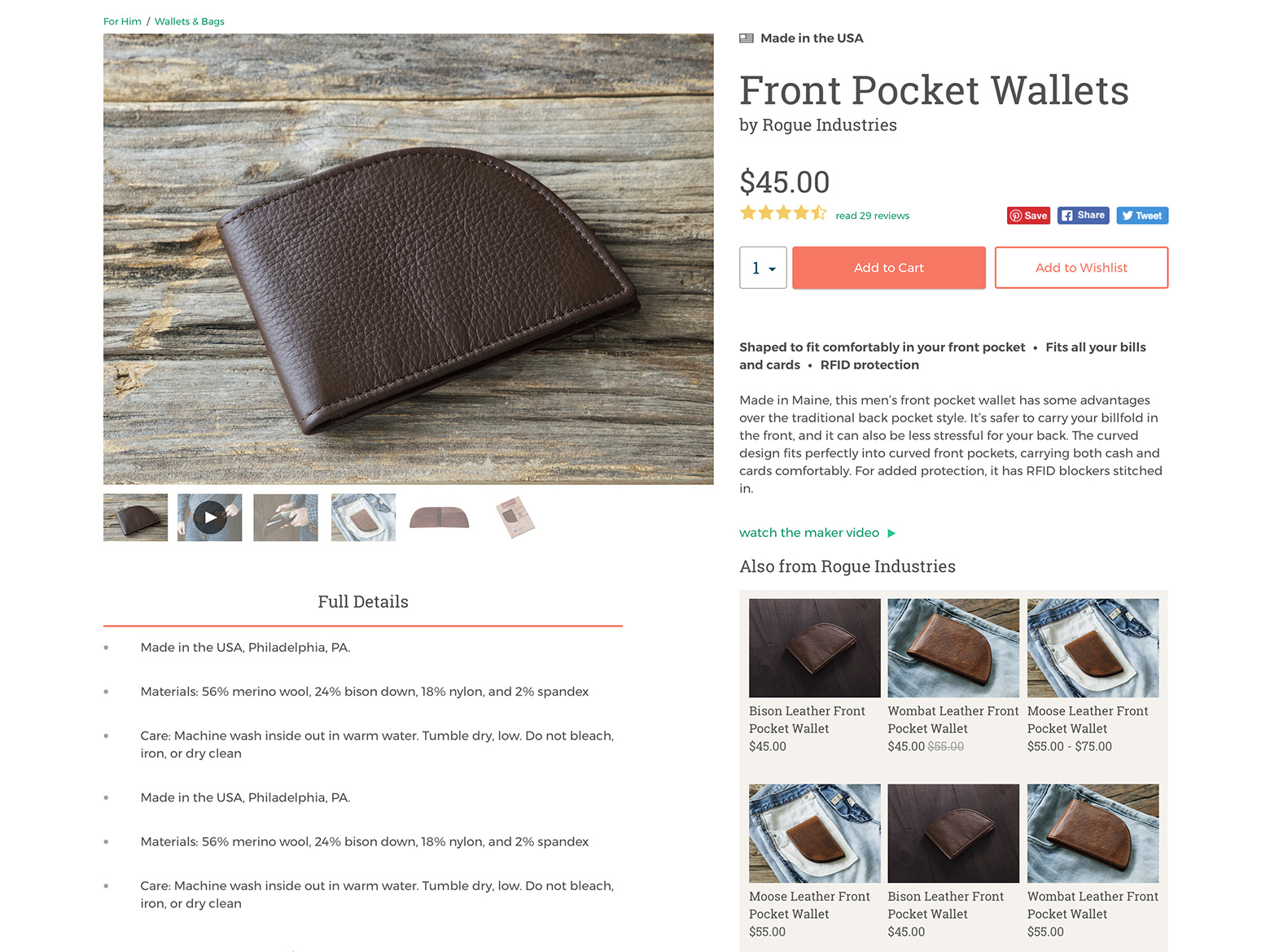
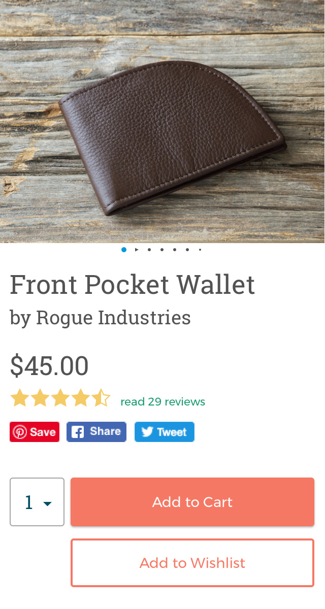
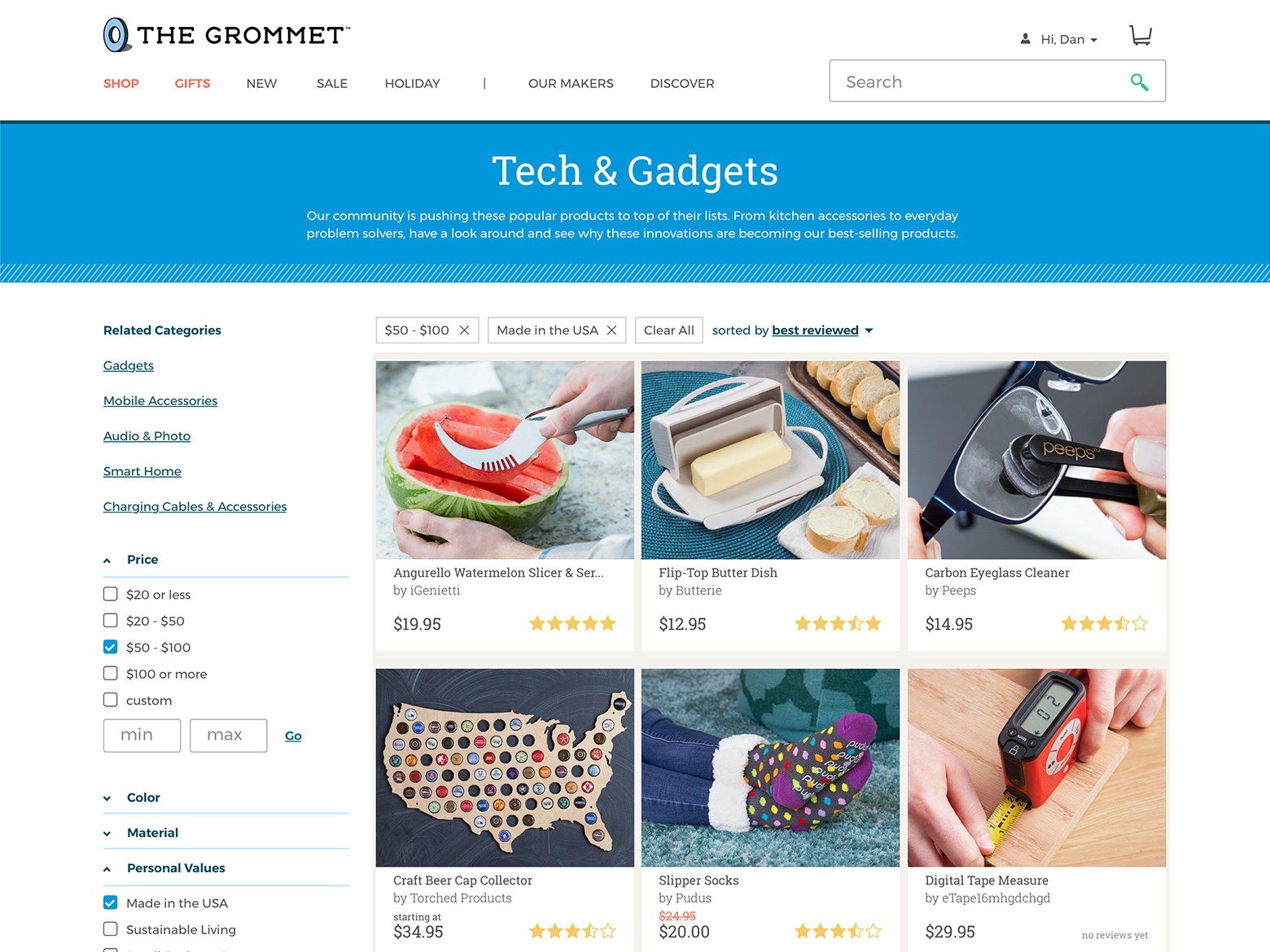
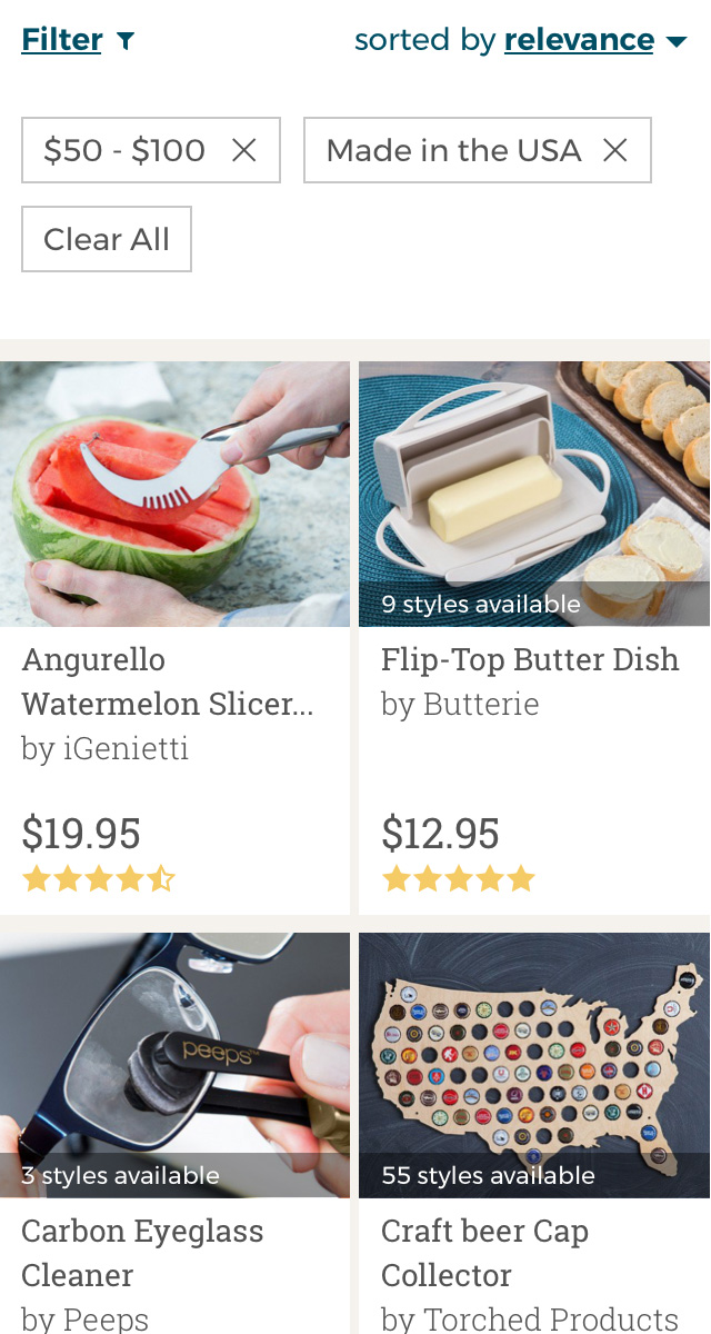
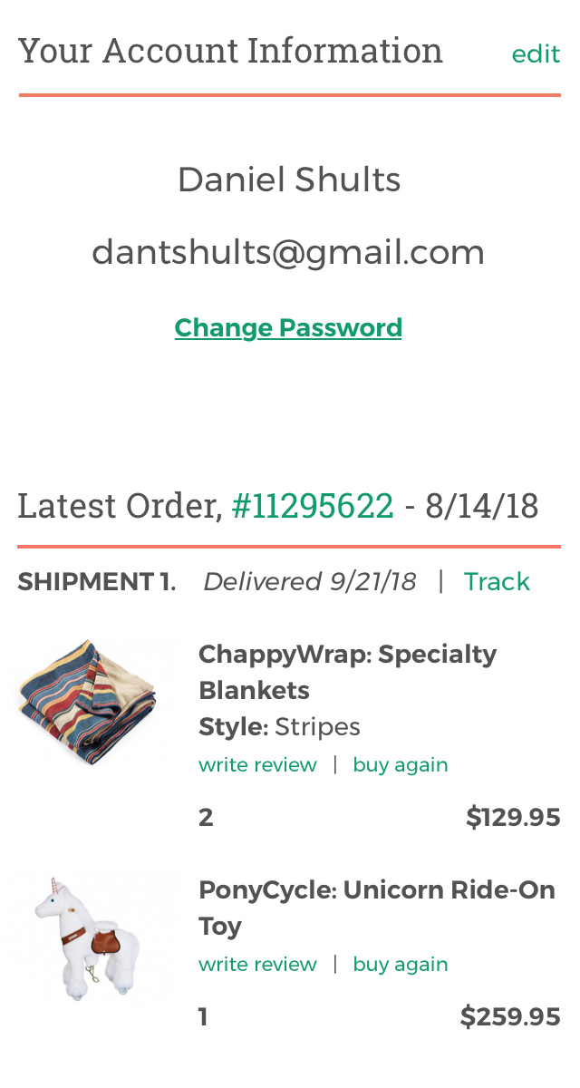
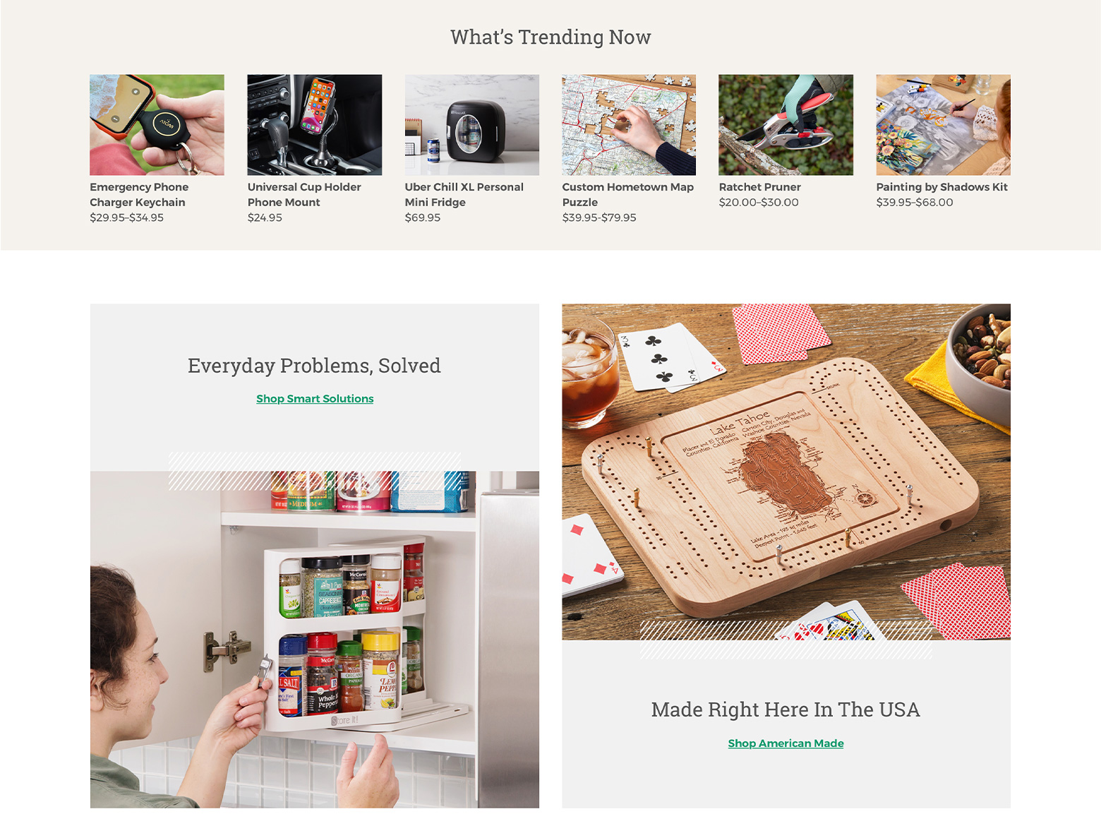
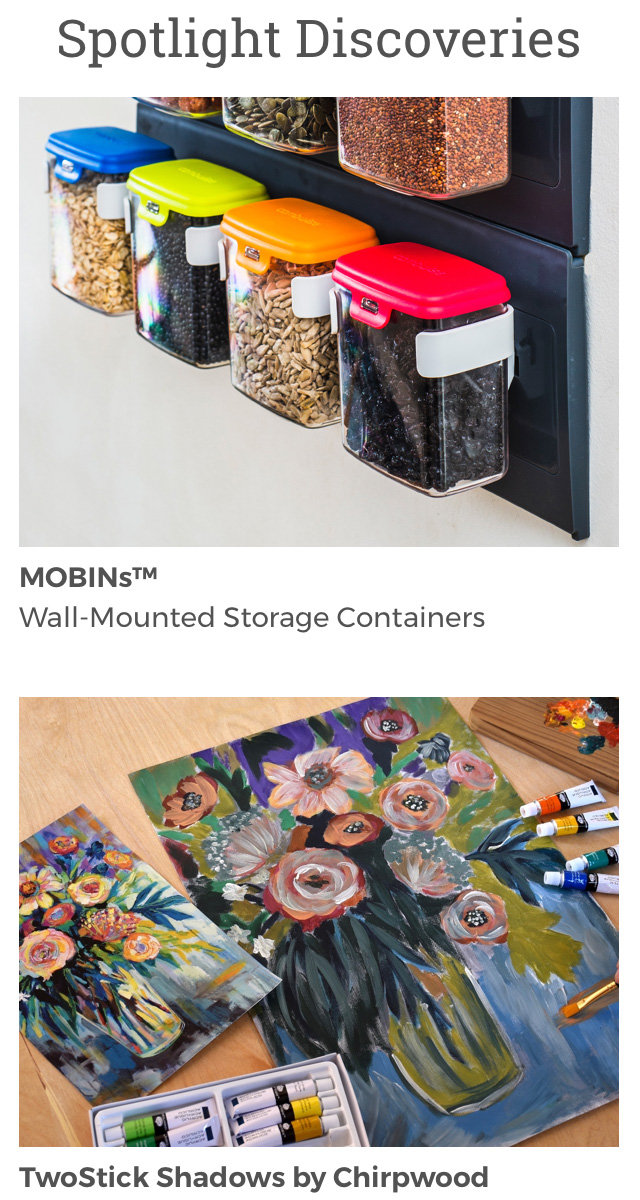
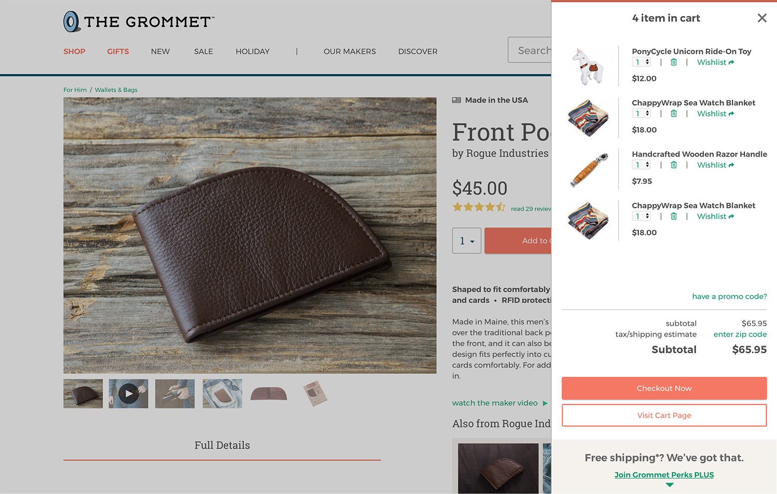
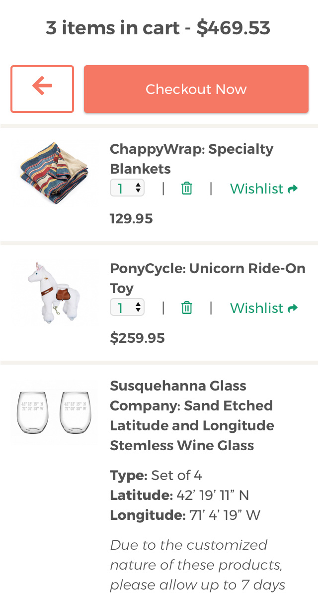
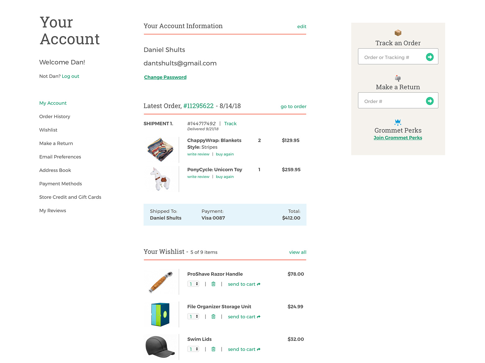
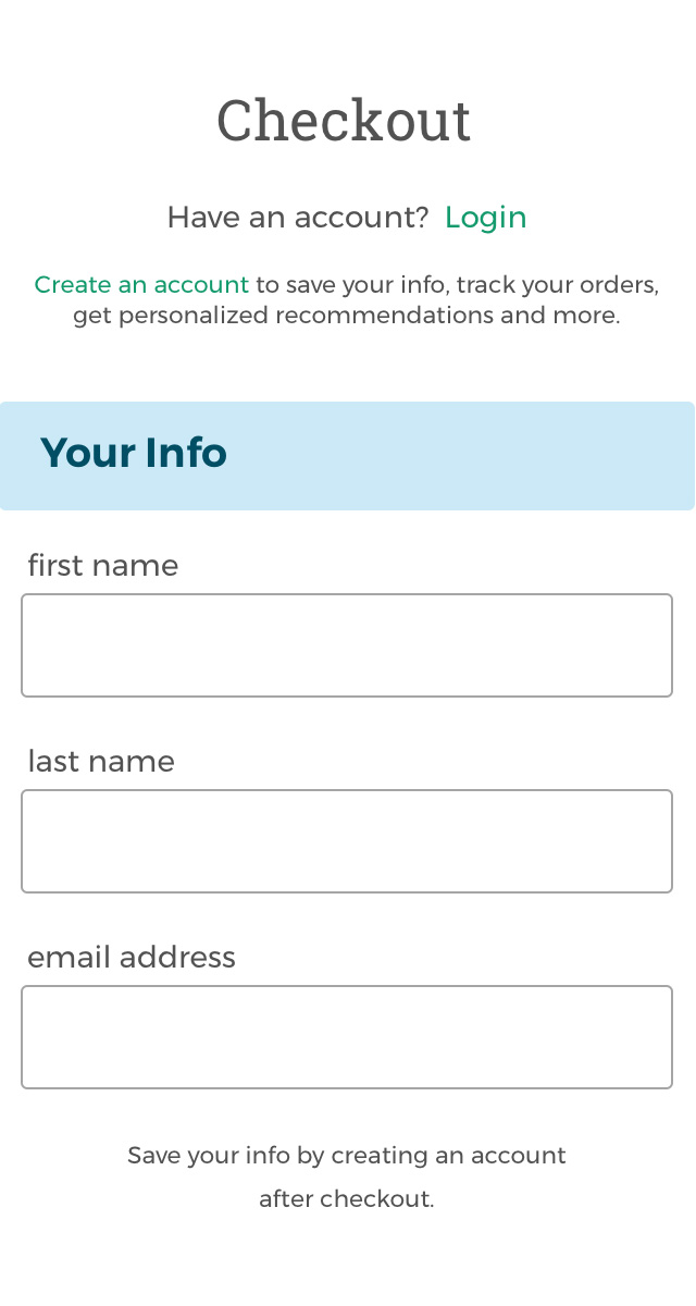
Results
The following images reflect some of the final deliverables which resulted from this project.