ad tech brand identity
modern. clean. high tech. friendly.
As the lead designer at Visible Measures Corp., I was tasked with developing a new brand identity system for all materials, ranging from our website, to our sales decks and sheets, to our business cards, emailers, and more. Working closely with our Product Marketing and Sales teams, I created an entire suite of materials with a cohesive, recognizable identity centered around solidifying our expertise in a technical field, while remaining friendly and accessible.
Early in the process, we explored various typefaces, colors, and photographic styles, in addition to varying types of iconogrpahy and illustration. After an initial run of materials, I spearheaded a “brand audit” in which we reviewed, critiqued, and ultimately nailed down the style with which we would move forward.
Read on, and check out more materials here.
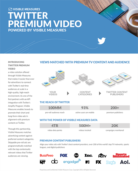
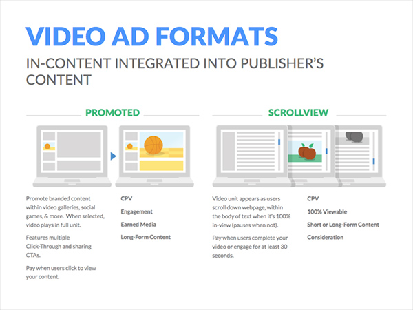
A sample one-sheet, which demonstrates several design motifs.
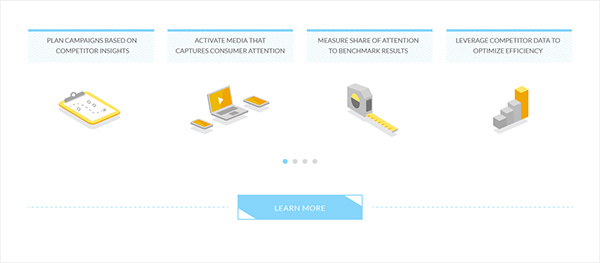
Fun, energetic colors pair well with the isometric “technical drawing” illustrations. These appealing headers ease readers into the more imposing details which follow.
ONE-SHEET header motif
The bold, bright color palette, playful illustrations, and use of photography are all intended to make the sheets appealing and inviting. Leaving them fairly open and low-density also provides a smoother transition from the topic of the sheet to the more dense and technical information which follows.
Several brand principles can be seen here, which are tenants of the wider Visible Measures brand system. Among them are the use of diagonal corner images, isometric illustrated elements reminiscent of technical drawings, and our signature typeface and color palette.
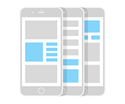
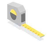
custom icons + illustration
Icons and more detailed illustrated content are custom made and centered around being clean, legible, engaging, and fun. Where appropriate, isometric illustrations are used. All icons and illustration use and reinforce the Visible Measures color palette.
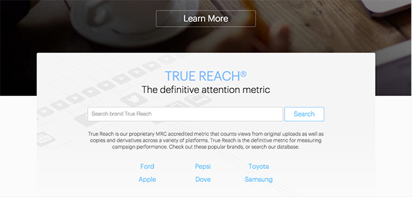
brand motif gallery
Across web, print, presentations, and more, the tenants of Visible Measures brand design represent themselves again and again, reinforcing a unified message. Keep an eye out for use of corner cut photos, isometric icons and illustrations, and consisten use of fonts, colors, and layouts.