eCommerce Seller Portal
Online Marketplace Solution
Since its inception, The Grommet’s mission has been to help grow the small businesses whose products we carry. We approach this task with a combination of direct support and self-service tools. Historically, the focus was on new-to-market products, which meant many of our suppliers were not already familiar with the ins and outs of online marketplaces. For some, The Grommet was the first online store in which their products were sold. Because of this, The Grommet had a heavy hand in helping them manage their consumer-facing assets, and provided fairly rudimentary tools to help them process their orders, and otherwise manage their online business.
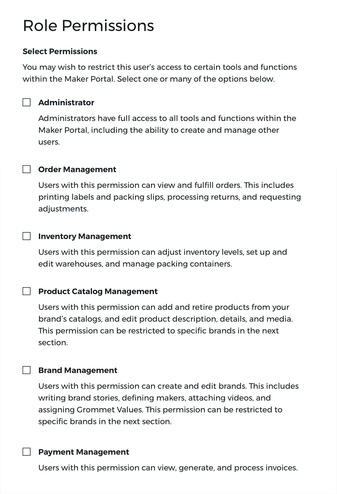
With more sophisticated partners come more user types. Managing permissions across roles was a major new feature.
Scaling Up
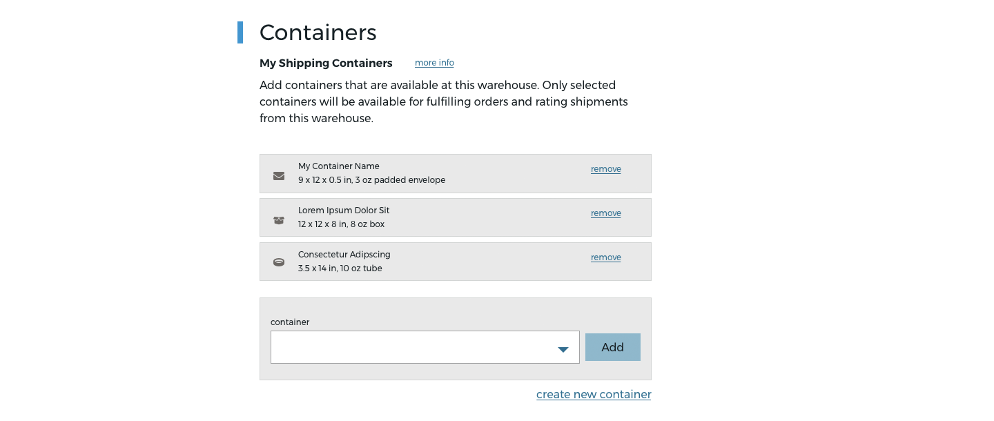
However, in recent years, The Grommet has taken an interest in broadening their catalog to include more established suppliers. Some of these businesses have a wide variety of products, and want the ability to manage every part of their ecommerce back-end manually. This includes creating and listing products, setting up warehouses, managing inventory, processing orders, generating invoices, and much more. The Grommet provided order processing tools, but nearly everything else was handled manually through account managers. If we wished to support a growing catalog of more sophisticated suppliers, it was time to build them robust self service tools. Of course, we also did not want to alienate our less experienced partners, so a careful consideration of different user types was a must.
User and Competitive Research
The effort to design a new set of B2B tools began with extensive research. Working closely with a product manager and another UX Designer, we surveyed a broad cross section of our supplier partners to better understand how they used our existing tools. We also collected information about what other supplier/seller platforms they worked with on a regular basis. While we were excited to design a custom solution, it was important for us to evaluate whether an existing third party tool, especially one which has integrations with other marketplaces our suppliers use, could be viable. Unfortunately, the unique requirements for selling products on The Grommet made it impossible to find an existing solution which could meet all of our needs.
Still, we understood that learning and managing multiple interfaces placed a strain on sellers. It became our priority to ensure our tool could easily import and export data to and from other platforms, and that the interface would be intuitive to those already familiar with Shopify, Amazon Seller Central, etc.
We did not wish to reinvent the wheel for parts of the experience where familiarity and industry standards would reduce friction for sellers.
Prototype and Iterate
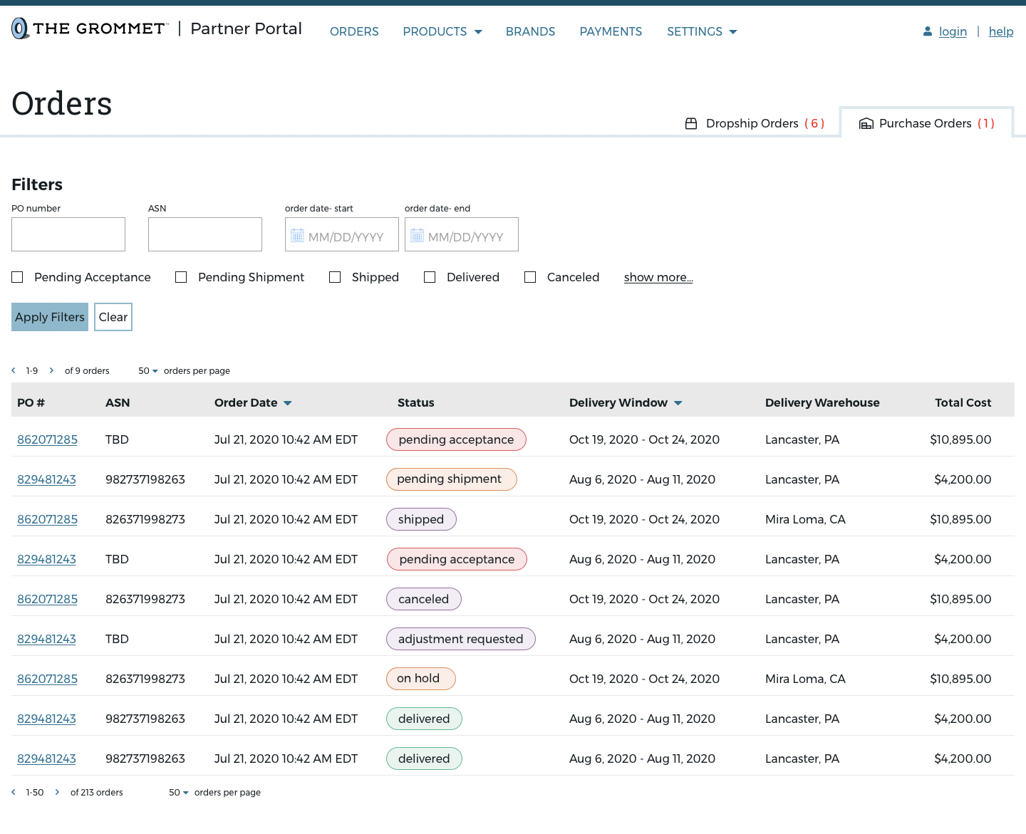
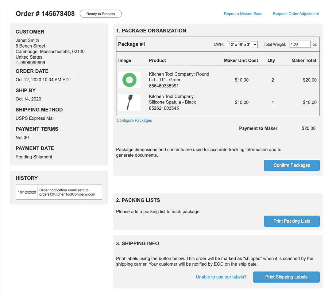
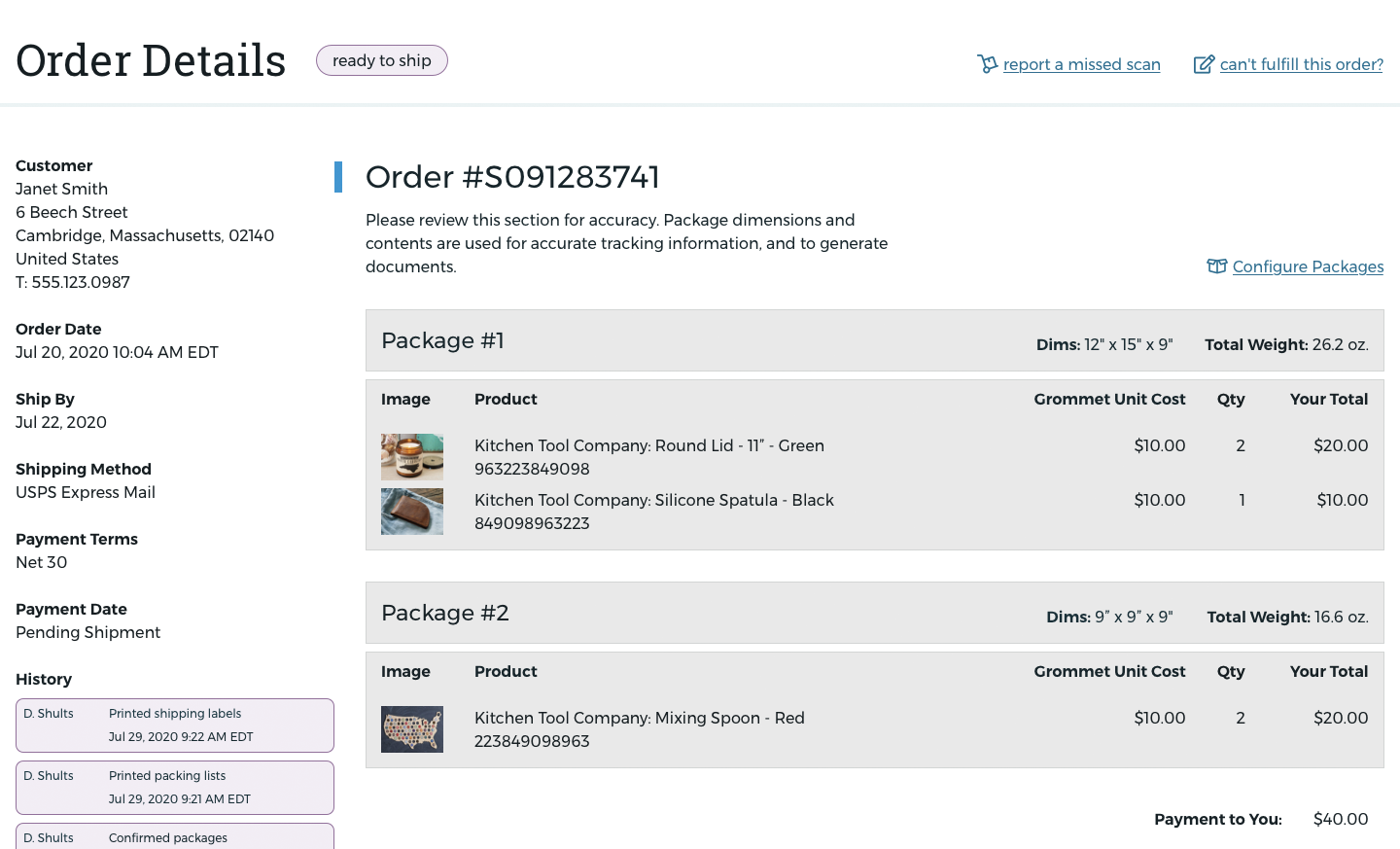
What followed this research was an extensive period of prototyping, testing, and iterating on core functionality, as well as specific pain points we had uncovered. An associate designer reporting to me executed on this effort while a product manager and I provided input and guidance. The focus of this period was on the most common daily activities of users. Creating a single-stream order fulfillment experience for partners processing both direct-to-consumer orders, and large purchase orders for our warehouses was paramount.
Different sellers process orders in different ways. Our system allows them to approach the necessary steps in any order, and enter custom values when needed.
Design Systems
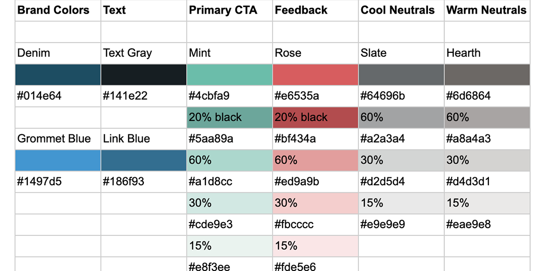
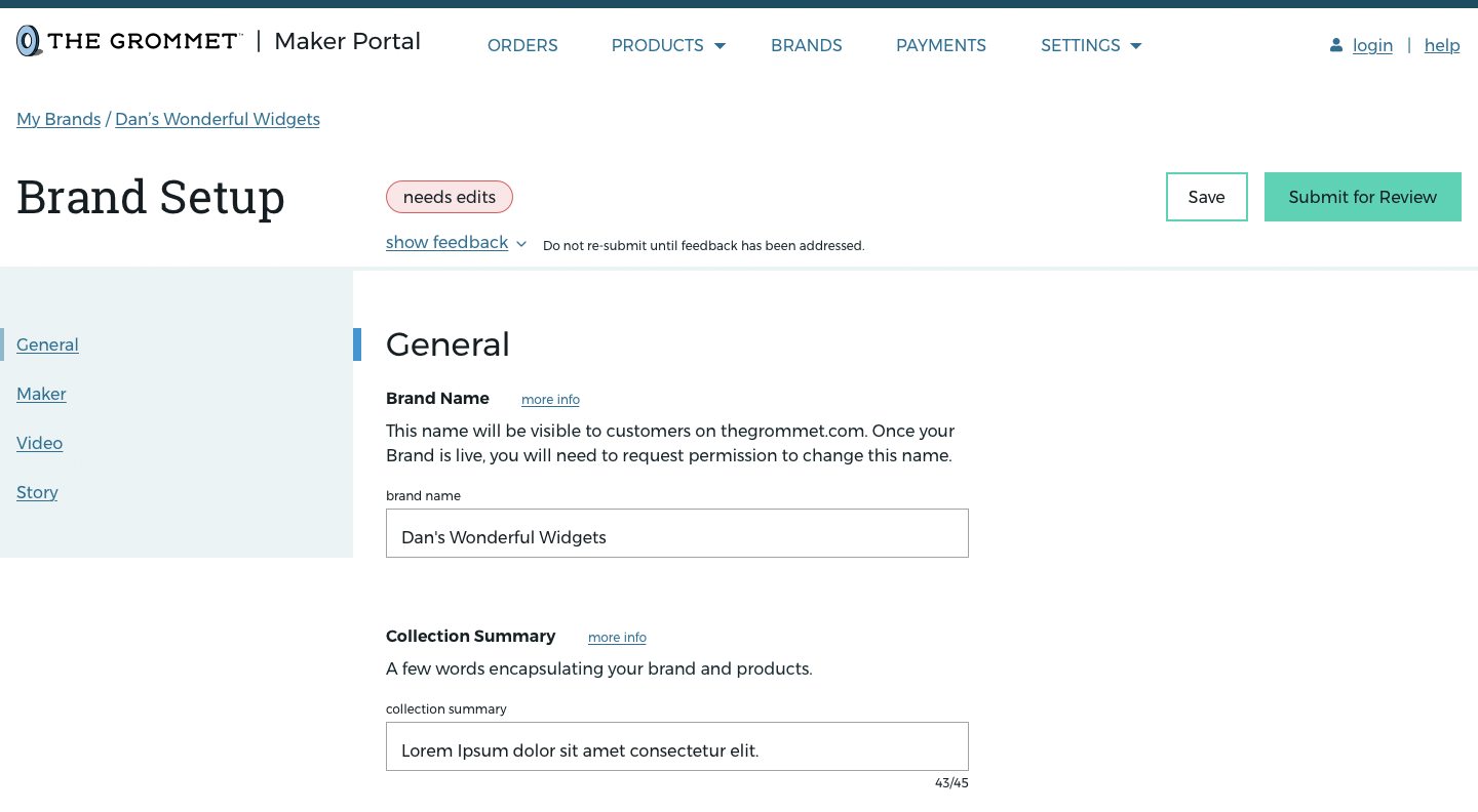
In tandem with the user experience effort, it was also necessary for us to develop a new UI system. Having implemented new UI during the full redesign of the consumer-facing site, we wanted something familiar feeling and on-brand, yet distinctive enough to indicate a workspace, not a part of the consumer experience. We addressed this by sticking to our brand typefaces, and rooting the colors in shades of blue which had a strong correlation with The Grommet brand.
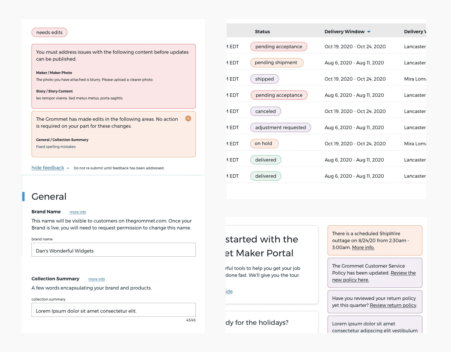
Our supplier tool is unique from many others in that it does not allow users to deploy updates directly to the live site, rather they must first be approved, rejected, or edited. As a result, the platform must give feedback to users on the status of content, as well as allow for more direct messages to be delivered from internal Grommet teams.
To help distinguish such messaging from other parts of the interface, I developed a dedicated palette of styles to be used specifically for communication coming from The Grommet system. In this way, the entire interface was neatly divided into a) tools and functions users could leverage to process or submit their work, and b) statuses and feedback from The Grommet.
The feedback styles are denoted by bright colors, and rounded bounding boxes with a 1px stroke. All of these stylistic elements are restricted from other uses.
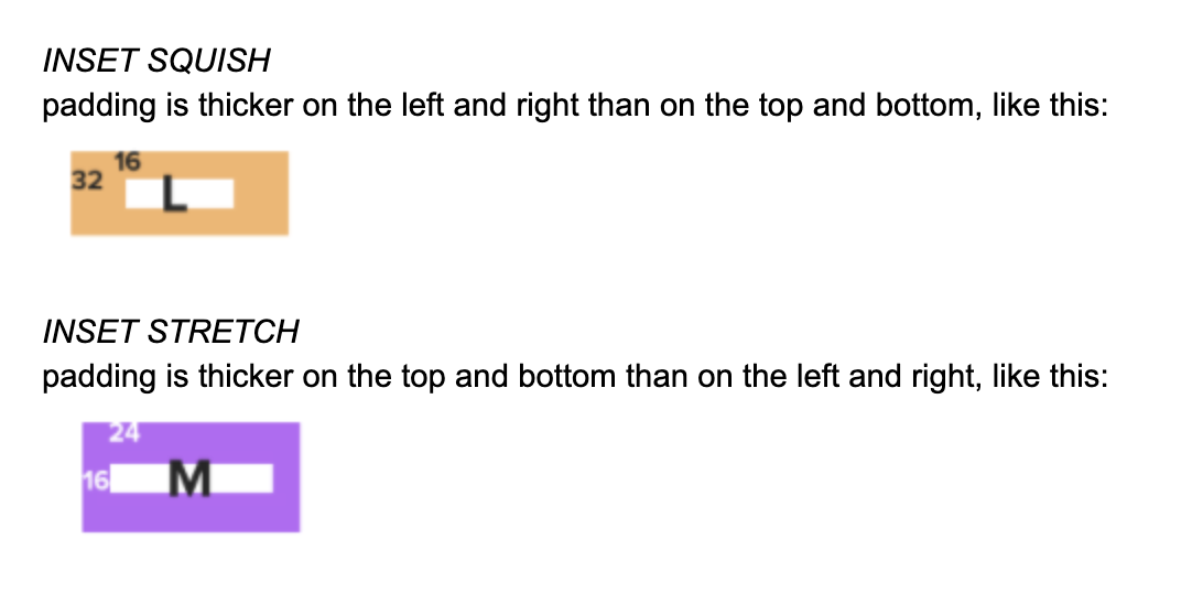
Excerpts from the styleguide I produced for this project.
Tools and Rules
In addition to these considerations, I took many of the lessons learned from the Grommet Consumer Site Redesign and applied them to this new design system. I employed a similar column grid system, and an even more robust spacing and sizing system based on a fundamental unit of 8rem, and sizes and spacings based on powers of 2 (8, 16, 32, etc.). By combining these rules with a set of flexibly designed components and templates rooted in atomic design principles, our engineering team could take specs or wireframes and begin building with minimal oversight from Design.
Results
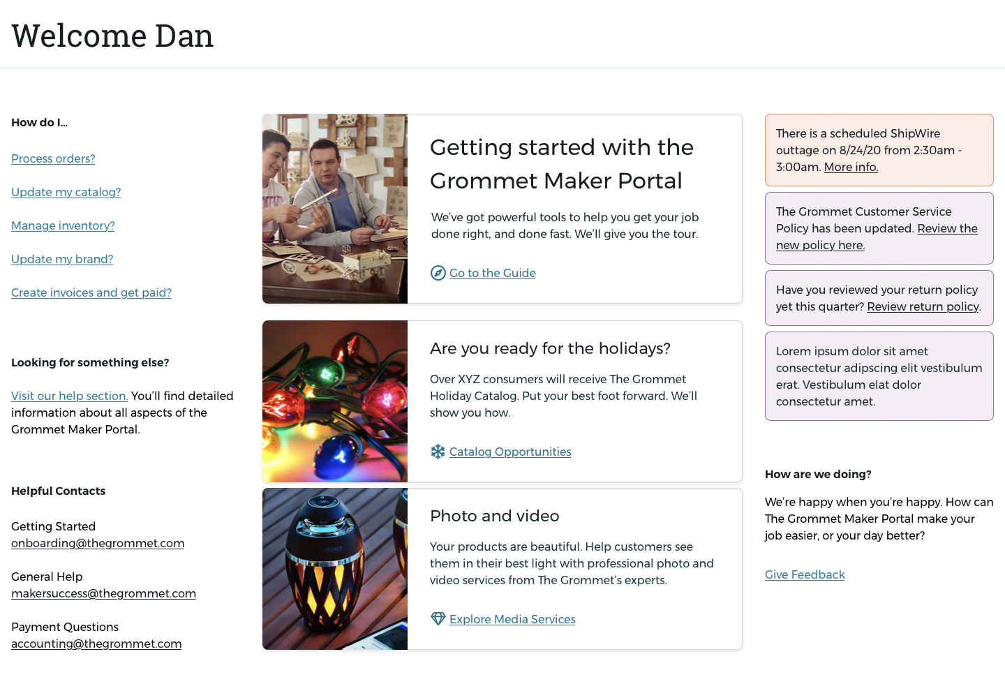
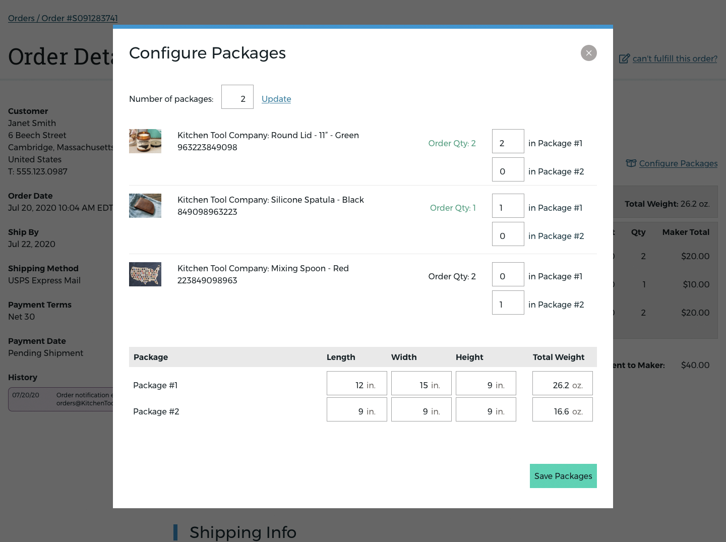
Below, you will find additional screenshots of various sections of the new tool.